If you place images to a layout with a maximal width (like this webpage here), you may encounter the problem that you have images which are too large to display. Hence, the image is only shown in a lower resolution. But when we want the user to still be able to view the image in its full glory, we need an additional way of interaction. One could be to provide a link to the image in its full size but then the user has to leave the current page which breaks the attentional flow. A lightbox is a very common and nice way to overcome this issue which allows viewing images in higher resolutions without leaving the current site. The image is shown enlarged on the same page as before and the rest of the site is hidden in the background (but still visible) as seen in the following example.

In an abstract way, a lightbox has to handle two different states: the normal mode where the image is shown as usual on the site and the lightbox mode where the image is shown enlarged. Somehow the user must be able to switch between these states, e.g. by clicking on the enlarged image (or whatever you prefer).
Technically, there are different ways to realize lightboxes. A common approach is to use a JavaScript library. These have the advantage of abstracting most of the details for you but also requires that the user has JavaScript enabled and add additional bloat to the webpage since the JS code must be loaded as well. There are approaches, though, to realize lightboxes with pure HTML and CSS. One way is to use the :target pseudo-class selector (example) which works by using page anchors (e.g. #linkToSectionOfThisSite) to distinguish between the two states. However, this has the disadvantage of altering the user's browsing history, i.e. the back and forward navigation. If a user opened and closed a lightbox realized in this way, pressing the back button would result in showing the enlarged image again. Since this is not a user-friendly behaviour, in my opinion, I searched for a different solution which I am presenting in this article.
The idea is to use a hidden input element to handle the states and a corresponding label element which wraps the image and links it with the input tag. In HTML, this could be realized as
<!-- The input element is hidden and is only responsible for handling the state -->
<input id="lightbox:CSSLightbox_ExampleImage" class="lightbox" type="checkbox">
    <!-- The label connects the child image with the input element so that a click on the image corresponds to an event to the input element -->
<label for="lightbox:CSSLightbox_ExampleImage" title="Click to close">
  <!-- Image which is selectable by the user (in the article to enlarge and in the lightbox to close) -->
  <img src="/content-blog/Informatics/Web/CSSLightbox_ExampleImage.jpg" title="Click to show the image enlarged" alt="Example image for the lightbox (showing a dolphin)" width="300">
</label>
As you can see, a checkbox is re-used for our purpose and since the image is attached as a child to the label tag, every interaction with the image is an interaction with the label element which in turn triggers the state of the checkbox. You can't see that the input element is hidden since this is controlled via CSS:
.lightbox {
    /* Hide the input element */
    display: none;
    /* ... */
}
So, what is the intended change when the user clicks on the image? Obviously, the image should be displayed enlarged, but there is more: we want that the complete webpage is visible in the background – including the image itself (in its scaled-down size). The image inside the label tag is also used as lightbox image since only elements inside the label react on user interaction and we want that the user has also the ability to close the lightbox again. Hence, we need a duplicate of the image in the lightbox mode so that the original image is still shown in the background. This is realized via an additional image tag after the label element.
<!-- Background image shown in the article when the lightbox is active -->
<img src="/content-blog/Informatics/Web/CSSLightbox_ExampleImage.jpg" alt="Example image for the lightbox (showing a dolphin)" width="300">
Like before, the image is hidden by default and displayed again when the lightbox is active (via CSS, see below). As you may have noticed, there are also title attributes on the label and the img tags. They are used to guide the user with a default browser tooltip when hovering over the image in the normal mode (indicating that it can be enlarged) or when hovering over the label in the lightbox mode (indicating that it can be closed). Since the image is placed on top of the label, its title is normally shown. To make sure that the title of the label tag gets displayed in the lightbox mode, we have to disable the pointer events for the image1:
.lightbox:checked + label img {
    /* ... */
    /* Prevent that the title attribute of the image gets shown so that the title attribute of the label can be shown instead */
    pointer-events: none;
}
The following figure summarizes what we have so far and makes clear which image tag is responsible for what in which state.
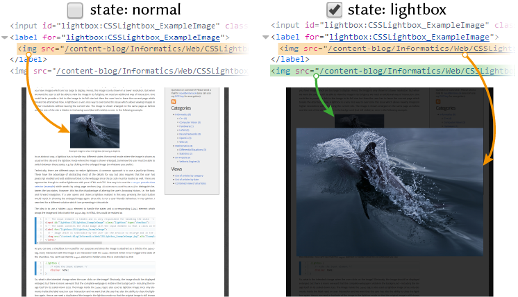
img tag corresponds to which image on the webpage.There are two open questions left: what layout changes do we need in the lightbox state and how do we distinguish between the two states in code under the constraint of not using JS? Both answers lie in the relevant CSS sections.
.lightbox:checked + label + img {
    /* Show the image in the text (both images should be visible) */
    display: block;
}
.lightbox:checked + label {
    /* Fade out the rest of the site so that the image appears in front */
    background: rgba(0,0,0,0.8);
    outline: none;

    /* Make sure that the lightbox is visible in front and fills the complete screen */
    position: fixed;
    z-index: 999;
    width: 100%;
    height: 100%;
    top: 0;
    left: 0;

    display: flex;              /* Allows easy alignment */
    justify-content: center;    /* Align vertically */
    align-items: center;        /* Align horizontally */

    /* ... */
}
.lightbox:checked + label > img {
    /* Show the image on a white background (better for transparent images) */
    background: white;

    /* Reset resolution to default */
    width: auto !important;
    height: auto !important;

    /* Don't fill the complete screen with the image, it should always be a bit from the site visible */
    max-width: 90%;
    max-height: 90%;

   /* Remove any outer filling which might lead to white borders (due to the background filling) */
    padding: 0;
    margin: 0;

    /* Prevent that the title attribute of the image gets shown so that the title attribute of the label can be shown instead */
    pointer-events: none;
}
The first block (lines 1–4) is responsible for showing the image in the article via the second img tag when the lightbox is active. In the second block (lines 5–23), we fade out the background, enlarge the label to the full size of the page and make sure that every element inside the label is displayed in the centre of the page. Note the use of flexbox which is a handy way of aligning elements of the page. In the third block (lines 24–42), we ensure that the image can be displayed in its full size but still leaving some margin to the borders (but this is only a matter of preferences).
Actually, the interesting part here is .lightbox:checked where the :checked pseudo-class is used to style the page differently depending on the state of the checkbox. The rule .lightbox:checked applies when the checkbox is active, i.e. via a click on the image in our case. But the rule does not stop there. E.g. in line 5 (.lightbox:checked + label) we actually select the first label via the adjacent sibling operator (+). This means, whenever the checkbox is in its checked state, we select the label which is placed after the input element and style this label (and not the input tag!) with the definitions of the lines 6–22.
This is quite interesting if you think about it. We relate the style of one element (label) with the state of another element (input). And the state control element does not even have to be visible. You can apply this technique in many scenarios. The only thing which you need to make sure is to place the two elements near to each other so that you can select them via the sibling combinators.
The following JSFiddle shows the complete code and lets you play around with it. Besides what I have shown so far, there is additional code in the CSS section covering some details I skipped (e.g. how to avoid some input selection glitches). I invite you to go through the comments if you are interested in these aspects.